 |
| Screengrabbed from a PDF published by GCDN. I particularly don't like that bottom one because when I look at it, all I see is Hurricane Ike's storm surge covering the lowlands north of Coryell. And I see the next hurricane's storm surge. Those waves appear to be overtopping each other and coming straight at me. |
(1) Why weren't residents notified via a realistically-accessible means of information transfer that a logo choice was even being considered? As I've observed in other posts and on one or two GCDN comment forums, I'm signed up to receive pretty much every e-mail blast that the City issues. A google search of my email stack revealed neither the word "logo" nor the word "marketing" mentioned anywhere in approximately the past six months.
Expounding on that idea...
(2) Why weren't residents consulted on the final choice that was made? City Council missed a great opporunity to actually make itself available to its own constituents here because potential logo designs could have easily and cheaply been put to an on-line vote. When Texas put the new license plate design to a vote a few years ago, people were so overjoyed at the chance to participate in the decision-making that they hobbled the state's computer system: "We're really excited people want to vote. It tells us we've done the right thing to put it out there," Perkes said. "However, not all of the more than 20 million registered Texans can vote at once. So we've had a few glitches, people have slowed down the system."
 |
| The people spoke. You have to respect the results. And you have to respect that they were given the opportunity to vote in the first place. Screengrabbed from this Chron article. |
(4) If a commercial design has to be chosen, why does it have to represent such a small minority of our geography and our population? Take a look at a map of the city limits of League City:
 |
| Low-res screengrab from Googlemaps. |
 |
| It's about a two-mile stretch north of Marina Bay Drive, where a tiny minority of our population lives. Screengrab from this Wikipedia entry. |
(5) Why does the logo have to be so profoundly formulaic? OMG, could there possibly be a more "been there, done that" choice than a stylized sailboat? Do you doubt me on this point? If so, behold this collection of muncipal logos grabbed from the internet during a sixty-seven-second image search that I just did:
I could go on and on with those, but this is the point: Is a stylized sailboat really the best we could have done?
 |
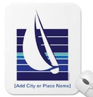
| NO KIDDING!!! Sailboat logos are so common that Zazzle sells templates for $12.95. |
 |
| We have only had this one for four years now. Screengrabbed from this Chron site. |


The oak tree seal is remaining to preserve our heritage.
ReplyDelete