 |
| Example configurations screengrabbed from this Supreme Windows site. |
Here (gulp) is some of what the internet offers up in the way of ideas, almost all of them pathetic in my opinion:
 |
| You can install these plantation-style arch shutter-y things, but my issues with these are as follows: (1) They look very traditional, and our house is transitional to contemporary, so they won't fit this style. (2) Almost all of them are fixed in place and un-openable. Why even have something that blocks the window entirely? I like being able to look at the sky through my office half-round, even though it's a pain in the butt when the sun is shining directly through it. (3) They are frightfully expensive. Screengrabbed from this eDirect Blinds site. |
 |
| Sorry - I cannot look at any tie-back or swagged drapery and not think "1970". This is a room where Sean Connery as James Bond could walk in and not look the slightest bit out of place. No thanks. Screengrabbed from this TLC site. |
 |
| There are cellular-style shades in fixed or moveable configurations, but they are expensive - I've been quoted around $300, just for the half-round portion, not for the cellular shade in the rectangular window below it. I don't like my window enough to spend that much money on it. The window itself did not cost that much!! Also, I do not recommend cellular shades in general. I invested big bucks in some at a previous house circa 1995 when they were first becoming very popular, and I found that bugs would crawl inside the cells and poop there, leaving unsightly little brown dots that made permanent stains. So I ended up with a slight smattering of poop polka-dots in my way-too-expensive top-down-bottom-up shades. Ugh. Screengrabbed from this Symphony Shades site. |
 |
| Love this, "A" for originality, and it would look great with a more contemporary-styled home. It appears to have been someone's custom idea. However, as much as I like it, it would not work in my application because my issue is direct sunlight coming straight through my half-round and screwing up my computer display. Screengrabbed from this Amaysn Creations site. |
 |
| This looks like something my Grandma would have had, and she passed away 25 years ago. I loved my Grandma very much, but my house has no place looking like hers did. Screengrabbed from this Adjustaview site. |
 |
| This is palatable, but way too traditional for our house, and this half-round option would not block enough direct sun. Screengrabbed from this Houzz site. |
 |
| Again, very traditional, but tasteful, at least. Screengrabbed from this Drapery Design blog site. |
 |
| Grandma strikes again, big time. Run for your lives!! Same URL as above. |
 |
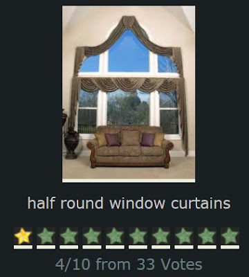
| Four out of ten?! These voters are wa-ay too generous!! Screengrabbed from this KeywordPictures site. |
 |
| This is one of the very few examples I found on the internet showing a drapery configuration that might be adaptable to contemporary-transitional styles. However, this approach works best to unify multiple arched windows in proximity, and I only have one standalone window. Screengrabbed from this Proctor Drapery and Blinds site. |
 |
| Tract home design trauma!!! HELLLLP!!! Now it looks like someone's Grandma is hiking up her skirts!! Silver alert!! :-) Screengrabbed from this Houzz site. |
 |
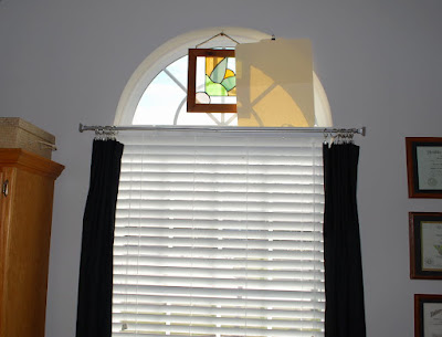
| Oh my gosh. Read it and weep: that's a manila file folder thumb-tacked to the drywall. But as pathetic as it is, it scarcely looks worse than some of the very expensive "custom" examples I showed above. I can't have direct sunlight on my computer monitors. I initially hung that piece of stained glass in there trying to cut down on some of it, but it wasn't large enough or the correct shape. (Incidentally, that's a very old stained-glass window I bought in Taos New Mexico for two whole dollars many years ago, back before it was considered uber-cool to hang out in Taos New Mexico). |
But obviously a tacked manila file folder isn't the kind of option I want to keep long-term either, so I was able to at least come up with a slightly better interim functional solution, as follows:
 |
| I know that's bizarre, but it's a giant paper and bamboo folding hand fan and it's just balanced there on the top of the casement without being attached. |
And I can also do this with it:
less than twenty bucks including shipping.
That particular solution was probably underwhelming for you, so I'll reveal another of my prototypes. I love to re-purpose "found objects" from around the home. The creative thought process helps to keep my middle-aged brain from ossifying.
 |
| Here's a close-up of the base. The old photo tree is simply sitting on the top rail of the two-inch blinds. It couldn't be easier. |
 |
| This idea is reminiscent of the Pottery Barn retro-looking starburst mirror produced a few years ago but since discontinued. I have long jones'd for one of these, but could never see my way clear to spending five hundred dollars on a mirror. These things were such design home runs I have seen prices in the aftermarket exceeding the original retail price by 20% to 30%. There were knock-offs produced but nothing I've ever seen could hold a candle to the artistry of this one, hence the price. So I decided not to spring for such a wildly-expensive mirror, but I've been on the look-out for ways to incorporate a similar feel into my home, in some location, using some other element that echoes this idea. Repurposing my un-used photo tree such as I've started to experiment with above... that might be the solution. For ten whole dollars plus whatever the "burst" circles cost me. |


No comments:
Post a Comment
I'm forced to moderate comments because the spammers have become too much for me to keep up with. If you have a legitimate comment, I will post it promptly. Sorry for the inconvenience.