Friday, December 21, 2012

Non-apocalyptic rat race

Last night around 10 p.m., I stepped onto our cold back patio only to watch a rat make a mad dash across my path, coming within six inches of my right foot.  Although I've seen a hawk kill a rat in an adjacent yard, this is the first time I've had to deal directly with one within two feet of my own back door.

And I wondered why the sudden bold appearance here.  Rodents, of course, are not my favorite things.  I figured last night's encounter might have occurred because our neighbor with the outdoor cat undoubtedly took the poor thing inside last night given the freezing temperatures.  So the feline policeman was not on duty per usual. 

But the cold light of dawn revealed another potential explanation.
Something predatory sitting atop the light pole near the intersection of West Walker and Centerpointe Drive first thing this frosty morning.  Let's have a closer look.
He's giving me the cold shoulder, literally and figuratively.  A hawk, probably a red-tail, on the look-out for breakfast, but refusing to make eye contact with me, whom he knew was nearby but did not care to engage. 
That bird may have moved into this immediate area and may be driving the local rats to seek increased cover in closer adjacency to houses.  I don't have any unsecured food in my yard, other than my tomatoes (which something has indeed been eating many of) and my broccoli (which nothing has touched), but I doubt those things alone would draw rodents, which would primarily be interested in obtaining fat and protein, neither of which are contained within tomatoes and broccoli. 

So the world didn't come to an end today as some believe it would (humorous URL, that one), but it might yet come to an end for one rather large rodent.  A large bird of prey has the peripheral areas under surveillance, and my husband has already began a trap-a-thon campaign. 

Wednesday, December 19, 2012

Pedestrian peril

Back when I first started publishing my "Dash Cam" series in which I used my car's continuous-loop DVR to showcase what was happening on our city streets, I used to get emails from people I've never met - people who were dumbfounded.  They would tell me, "OMG, I just never noticed how bad that situation was." 

I've got a special computer folder titled "stuff I don't dare publish".  I really thought long and hard about filing these next two photographs, the second one in particular, in that folder and just sitting on them, because I see stuff like this and I get a bit afraid of what the fall-out might end up being if people are really able to wake up and parse the ramifications. 

So in this case, I will split the difference.  I won't say who, and I won't say when, and I won't say why.  But you can see for yourself where (NB FM 270, obviously), and you can see what. 
Welcome to your world without sidewalks, where our government agencies (and our taxpayers by extension) are too cheap to add a shoulder to the side of even our newest, most improved roads - not even a shoulder, let alone a sidewalk.  The billboard in the background is advertising a physical fitness regime, making this scene just a little bit surreal. 
I can hear in my mind some people snapping, "Oh, now, that's just plain stupid.  Noboby should be walking across that bridge with cars coming up behind them at 50 miles per hour in the same lane - that's just too dangerous."

Really??  What the F are these people supposed to do, exactly?  If folks find themselves with an immediate need to get into Harris County via this route, do you reckon that they should clamber down the bank and swim across to the other side of Clear Creek?  There IS NO other physical way across, except this right here.  This is all we've got. 
Approximately four thousand American pedestrians are killed every year because of issues like this.  We tend not to worry about them, though.  Instead of preventing the preventable, we like to collectively obsess over what to do about incredibly-rare and unpredictable events that take two orders of magnitude fewer lives, such as school shootings. 

This is just one of the reasons why I will continue to be so focused on sidewalks.  Because I happen to think that those four thousand Americans killed per year are worth caring about. 

Sunday, December 16, 2012

Half-round hell

It's the bane of every suburban tract home owner's design existence: the half-round or half-circle window.
Example configurations screengrabbed from this Supreme Windows site.
They look great on paper.  They even look great in your exterior facade.  But how in the heck are you supposed to dress them?!

Here (gulp) is some of what the internet offers up in the way of ideas, almost all of them pathetic in my opinion:
You can install these plantation-style arch shutter-y things, but my issues with these are as follows:
(1) They look very traditional, and our house is transitional to contemporary, so they won't fit this style.
(2) Almost all of them are fixed in place and un-openable.  Why even have something that blocks the window entirely?  I like being able to look at the sky through my office half-round, even though it's a pain in the butt when the sun is shining directly through it. 
(3) They are frightfully expensive. 
Screengrabbed from this eDirect Blinds site.
Sorry - I cannot look at any tie-back or swagged drapery and not think "1970".  This is a room where Sean Connery as James Bond could walk in and not look the slightest bit out of place.  No thanks. 
Screengrabbed from this TLC site.
There are cellular-style shades in fixed or moveable configurations, but they are expensive - I've been quoted around $300, just for the half-round portion, not for the cellular shade in the rectangular window below it.  I don't like my window enough to spend that much money on it.  The window itself did not cost that much!!

Also, I do not recommend cellular shades in general.  I invested big bucks in some at a previous house circa 1995 when they were first becoming very popular, and I found that bugs would crawl inside the cells and poop there, leaving unsightly little brown dots that made permanent stains.  So I ended up with a slight smattering of poop polka-dots in my way-too-expensive top-down-bottom-up shades.  Ugh. 

Screengrabbed from this Symphony Shades site. 
Love this, "A" for originality, and it would look great with a more contemporary-styled home.  It appears to have been someone's custom idea.  However, as much as I like it, it would not work in my application because my issue is direct sunlight coming straight through my half-round and screwing up my computer display. 
Screengrabbed from this Amaysn Creations site.
This looks like something my Grandma would have had, and she passed away 25 years ago.  I loved my Grandma very much, but my house has no place looking like hers did.
Screengrabbed from this Adjustaview site. 
 
This is palatable, but way too traditional for our house, and this half-round option would not block enough direct sun. 
Screengrabbed from this Houzz site.
Again, very traditional, but tasteful, at least.
Screengrabbed from this Drapery Design blog site. 
Grandma strikes again, big time.
Run for your lives!!
Same URL as above. 
Four out of ten?!
These voters are wa-ay too generous!! 
Screengrabbed from this KeywordPictures site.
This is one of the very few examples I found on the internet showing a drapery configuration that might be adaptable to contemporary-transitional styles.  However, this approach works best to unify multiple arched windows in proximity, and I only have one standalone window. 
Screengrabbed from this Proctor Drapery and Blinds site.
Tract home design trauma!!!  HELLLLP!!!  Now it looks like someone's Grandma is hiking up her skirts!! 
Silver alert!!
:-)
Screengrabbed from this Houzz site. 
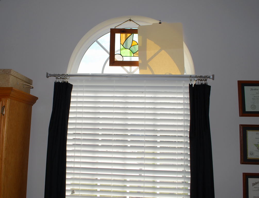
I inflicted the above pile of visual misery upon you for a specific reason: I needed to soften you up to the possibility that there just aren't any good options right now for dressing a half-round window in a transitional-style home.  Which maybe justifies your forgiveness of me for living with the likes of this for quite some time now:
Oh my gosh.  Read it and weep: that's a manila file folder thumb-tacked to the drywall.  But as pathetic as it is, it scarcely looks worse than some of the very expensive "custom" examples I showed above.

 I can't have direct sunlight on my computer monitors.  I initially hung that piece of stained glass in there trying to cut down on some of it, but it wasn't large enough or the correct shape. (Incidentally, that's a very old stained-glass window I bought in Taos New Mexico for two whole dollars many years ago, back before it was considered uber-cool to hang out in Taos New Mexico).   
I've heard Genevieve Gorder say that, if you have an arched window, just bite the bullet and run your draperies all the way up above it, because there's really not a single other thing you can do to dress it.  But I find that approach looks much better in a traditional rather than a transitional design, and it also looks much better if there are a number of windows in series, such as in the example pics given above.  I'm not yet sure that I want to do that here with this one standalone office window.  I've held the curtain rod in place above this half-round, and it just looked a bit... weird.  Especially because I'm aiming to keep very minimalistic thin drapery panels just to frame the window but not add a lot of weight.

But obviously a tacked manila file folder isn't the kind of option I want to keep long-term either, so I was able to at least come up with a slightly better interim functional solution, as follows:
I know that's bizarre, but it's a giant paper and bamboo folding hand fan and it's just balanced there on the top of the casement without being attached. 
Oddly enough, it doesn't look as bad as theory would predict.  The fan is a shade of white that matches the two-inch blinds perfectly, and the spines are natural bamboo of a color that matches the furniture. 

And I can also do this with it:
Most of my issue is with the direct sun streaming in through the right side of this window, so I can simply tip the fan over to block just that side.  And then simply remove it entirely when the sun is not being a problem. 
It would have been nicer if I could have found a fan as wide as the window, but this is the largest plain white one that the internet would yield.  And here's the best part: it was less than twenty bucks including shipping. 

That particular solution was probably underwhelming for you, so I'll reveal another of my prototypes.  I love to re-purpose "found objects" from around the home.  The creative thought process helps to keep my middle-aged brain from ossifying. 
Do you remember those desk-top "photo trees" that were popular for about fifteen seconds back around the year 2000?  They cost about ten bucks apiece and were made of metal (here, a stainless steel-looking metal that matches my drapery hardware) and you could insert cards or print photos or any other two-dimensional object into the clips and bend the "arms" into any desired configuration.  Well, here, I bent the arms into a semi-circle and I cut circles out of white cardstock, just for the prototype.  It wouldn't stop all the direct sun from frying my eyeballs, but during those times of year when the sun doesn't impinge upon this half-round, it could be used to diffuse the cross-lighting. 

I'm not done playing with this design yet.  I could make the circles a bit larger and black to match the drapery panels.  I could make them out of a translucent polyethylene or Lexan.  There are many as-yet-unexplored possibilities. 

Some clever bugger is going to find this photo on the internet, realize what a gold mine this represents within the obvious consumer retail vacuum, and figure out how to make a million bucks from it. 
Here's a close-up of the base.  The old photo tree is simply sitting on the top rail of the two-inch blinds.  It couldn't be easier. 
This idea is reminiscent of the Pottery Barn retro-looking starburst mirror produced a few years ago but since discontinued.  I have long jones'd for one of these, but could never see my way clear to spending five hundred dollars on a mirror.  These things were such design home runs I have seen prices in the aftermarket exceeding the original retail price by 20% to 30%.  There were knock-offs produced but nothing I've ever seen could hold a candle to the artistry of this one, hence the price. 

So I decided not to spring for such a wildly-expensive mirror, but I've been on the look-out for ways to incorporate a similar feel into my home, in some location, using some other element that echoes this idea.  Repurposing my un-used photo tree such as I've started to experiment with above... that might be the solution.  For ten whole dollars plus whatever the "burst" circles cost me. 
So, no runaway design coup with this blog post, but at least I've come up with a few new ideas for dressing half-round windows:  one crudely-functional solution and one other potential artistic adaptation.  Those will have to do until my fertile imagination can refine a better option.  And when I figure out what would work best here in a more permanent sense, I will post about it. 

Saturday, December 15, 2012

Newspaper newbies

'Tis the season for brain farting,
Fa la la la la, la la la la

Two unrelated random bits of newspaper-related amusing confusing here, just for grins.

First, Bay Area Citizen's confusion about League City's new police chief, title grabs from yesterday and today:
Before.
After. 
Can you blame them, really?  There's so much turn-over in League City that it's easy to get confused.  Part of me suspects that they did this intentionally, to amuse those of us who track the revolving doors. 

In case you were wondering, the correct answer is Kramm.  He seems to have an impressive resume and has definitely exhibited staying-power within our municipal system. 

Staying power to date, that is.  Let's hope they don't manage to run him off in the manner of so many other administrative leaders, such as this one, whose departure I suspect was obsurated by those allegations, or these, who made a point of leaving in tandem. 

OK, our second brain fart of the post has to do with Galveston County Daily News's confused administration of its new paywall.  I went ahead and signed up for a one month subscription, but not without an unnecessary helping of technical difficulty.
The first thing it did was refuse to associate the delivery address with the credit card billing address.  There was a radio button intended to mate the two, but I tried it twice and it didn't work, so I had to fill them both in manually. 

Here for reference is the subscription rate structure, screen-grabbed from this site:
But here is the response I got when I paid my fourteen bucks:

Four days?! 
That is one hell of an expensive newspaper.
OK, obviously their Active Server Pages were not functioning properly, but I figured that this was perhaps just an online glitch.  But I got the same information in a confirmatory email:
Good grief.
I guess I'll wait until December 17 and see whether my subscription money is actually going to disappear down a black hole.
Here is my advice for Galveston County Daily News: 

When you take money from people, especially when you take money for something that was previously free, you need to accomplish this task with grace and aplomb in order to minimize the chances that you will alienate your customers.  It's called "salesmanship" and there's nothing new about it - hundreds of thousands of internet businesses operate functional ASPs that accomplish this task seamlessly. 

The psychology of selling is surprisingly delicate and you would be wise to snap to this fact.  To give you an example, at the ripe old age of 15 when I started working six days a week as a waitress in a privately-owned Dairy-Queen style drive-in, we were rigorously taught that, if customers did not produce their payment immediately following the placement of their order, we were to prompt them with the line, "Let me give you your change" (it was a cash-only establishment).  It was forbidden to make any reference to the "taking" of money from the customer because that would offend their sensibilities - everything had to be couched in terms of what was "given". 

We would routinely encounter customers who would object to payment in advance of delivery, upon which we would apply the following psychology:  "If I wait to give you your change until after I give you your hamburger, first of all your hands are going to be full with your burger and shake so it will be awkward for me to hand you anything additional, and second of all, I'm going to have to get in line at the cash register behind the other waitresses, and I don't want your burger to get cold because you were made to wait unnecessarily."  One hundred percent of the time, that line worked to satisfy the balky customer, and they would pay promptly, up front as the system was designed. 

My point is, it's extremely important to handle the entire payment transaction in a manner that reflects maximum possible benefit for the customer.  With grace and aplomb.  This is a rule as old as human civilization itself, and I learned it thoroughly before I was even old enough to legally qualify for minimum wage (at the time, I was making $2.75 per hour - the same price as the burgers I was "giving").  There is no valid reason in this day and age why any business entity taking internet payments should screw this kind of thing up. 

With that said, may everyone have a relatively sane final mad dash to complete Christmas preparations.  May you enjoy a seamless and painless payment process wherever you shop this week. 

Wednesday, December 12, 2012

Of kids and kale

Vegetables are much like children: you can try your best to cultivate them, but they really grow mostly of their own accord.  Sometimes you give them every advantage and they simply fail to thrive, for reasons that defy comprehension.  Other times you ignore them completely and they sprout vibrantly wherever they happen to land.  The prevailing environmental conditions have an effect, but it can be an unpredictable one.  Here are a few scenes from my winter garden illustrating these basic realities.
I can't intentionally grow a dill plant to save my soul, but it will root spontaneously in the strangest of places - such as this beach rock mulch area which doesn't even have any soil beneath it - it's underlain by a thick landscape fabric to prevent the emergence of (you guessed it) weeds.  Despite these seemingly harsh conditions, this dill is divine. 

More dill volunteers, mixed in with the St. Augustine lawn.

More dill sprouting beside some delicious mint, which also appears to prefer growing where there is no real soil or water. 
Like a masochist, I insist on planting tomatoes every fall, but it's futile.  Tomatoes are a high-light plant that won't grow well this time of year because sun angles are too low.  I get a couple of handfuls like this, tops - not enough to justify the growing effort.
A cauliflower, finger for scale.  My caulis grew wonderfully last winter, which was abnormally warm.  This year, which has also been abnormally warm, they seem to be producing leaves like never before, but no heads are forming. 
These caulis may end up mostly being great fodder for vegetable macro photography... and great fodder for the compost. 
George Bush may not like broccoli, but I love the stuff.  It's a cold-weather plant and, last year, because of the abnormally warm temps, all my broccoli bolted - meaning, it turned into flowers before the heads had time to form.  I got a few nibbles out of it, but no real feeds.

Inexplicably, the heads formed better this year despite the fact that, until two days ago, we were having night-time temperatures 20 degrees above normal - conditions worse than last year.  This one shown above is still not a very well-formed head, but at least it's edible, and with the now-colder temperatures, I may get a few more days of growth out of it before I'm forced to harvest. 
Oh, and in case you're wondering what I did with all that backyard okra that I grew, blanched, and and then froze many weeks back, here's one of the results - shrimp and sausage jambalaya, heavy on the okra.  I based this dish on the Whole Foods recipe EXCEPT for the following foodshed-minded alterations intended mostly to increase protein and reduce carb content and reflect responsible buying to the extent possible:

(1) I use only Texmati brown rice, non-GMO and grown right down the road in Alvin, Texas.
(2) I increase the proportions of all ingredients relative to the rice, such that the rice becomes a more minor component.
(3) I use only fresh local Gulf shrimp from Rose's Seafood in Kemah.
(4) I use a Texas artisan sausage when I can find it - here, Poffenberger's jalapeno sausage.
(5) I use Tony Cachere's seasonings because they're really good!!
(6) I also use spices from The Spice Lady in Kemah when I can find them at the Clear Lake Shores Farmers Market.  A good chipotle ground peppe is a must for this dish (not just plain cayenne as the Whole Foods recipe calls for). 

This stuff freezes very well, and I usually make massive batches - at least five meals worth at a time - and store for future dinner efficiency.  Goes wonderfully with a heaping side of corn chips and some fresh fruit. 
Anyway, there are some pretty pics for your Tuesday morning.  Enjoy the brisk weather while it lasts. 

Monday, December 10, 2012

New idea for an art niche

It has become the emblematic add-on to any recently-minted tract house: the art niche, seemingly installed as a last-ditch effort to give buyers an opportunity to distinguish their own cookie-cutter gem from the identical plan that was built across the street from them. 
A diamond in the rough?  Screengrabbed from this Shirley Homes website.
Many folks seem to take these things literally, as in, they stick a single piece of art in there and call it a done deal, design-wise: 
Or perhaps a single piece of art plus potpourri.  Screengrabbed from this Royal Crest Homes website.
Also popular is the phenomenon of using these things to store dead dried vegetation: 
Methinks it underachieves, artistically-speaking.  Screengrabbed from this Merchant Circle site featuring Ramey Custom Builders. 
Still other folks use these things to showcase children as statuary:
This is our art niche as it appeared during the final stages of house construction.  We tried this display option for awhile, but the child kept escaping, so it proved to be an unacceptably high-maintenance option.  We had even more intense problems trying to achieve the same look with our dog.  Sit, Rover, sit!!  Stay!!  STAY!!!  Um, Rover...
:-)
There is, however, another art niche idea that I don't see anywhere else on the internet.  Let me say it again just so that those all-important search engines make no mistake:  I went through the first umpteen pages of Google images and did not see our art niche idea represented even one time, despite the fact that it should be pretty obvious. This is apparently a brand new art niche idea:
Instant wow-factor:  We converted ours into a museum-style built-in display case for collectibles, with a mirrored back and four "floating" glass shelves. 

I use mine for collectibles that have sentimental rather than monetary value, but I decided to show it as empty in these internet photos, just in case some yahoo were to see these pics and get the mistaken idea that my stuff is worth stealing. 
Let me explain how we achieved this, because this is the type of design info for which so many folks search frantically on the internet.
The very first step in this process is to measure the back wall of the niche and cut a mirror to fit it (remembering to leave enough gap on each side for the clip installation).  I had this mirror professionally cut at Admiral Glass in League City (audio warning on that URL - pause the embedded vid if you don't want to hear it) because I've always gotten excellent service from them and I shop locally whenever possible.  I also ordered it in a quarter-inch thickness, and it's a large mirror, so it ate the majority of the budget for this project. 

If someone wanted a less expensive solution, eighth-inch sheet mirror could potentially be used instead, depending on the size of the niche.  Additionally, sheet mirror sections are often sold for very low prices at yard sales following bathroom renos.  I've picked up huge sheet mirror remnants for ten or twenty dollars apiece at yard sales.  It would not cost much to get an existing sheet cut down to size. 

The mirror installs with the same type of clips as you'd use for any mirror mounted directly to sheetrock.  Because this mirror is so tall, we used side clips (one shown in this photo above) as well as top and bottom clips. 

I should mention that, because we commissioned the building of our own house, we did order an "eyeball" light at the top of the niche.  It was an extra $100 to specify this in our contract.  If a person had to instead retro-wire a niche for a light post-construction, I'm not sure what it would cost. 

We chose a powerful LED spotlight that would throw light downward preferentially, rather than radiating in all directions.

If you had an art niche without a light in it, you'd have to evaluate whether this idea would work well given your available light.  In a brightly-lit area of a home, I imagine it could still achieve the desired effect because the mirror really helps to amplify the available light. 

 
These inset shelf tracks are available in big box hardware store at an extremely low price - a few dollars per strip.  They are installed by simply screwing them into the wall at regular intervals.  Usually art niches are extensively framed by the builder, so it's not difficult to bite into the wood behind the drywall for a secure installation. 
Obviously four hanging strips needed - two for each side.  They are very easy to cut with a hacksaw to the desired length. 

The main thing you have to be careful about is this: make sure you cut each one at the same place in the hole/slot pattern, because otherwise, when you install them, the clip holes won't line up horizontally and your shelves won't end up being level. 

There are fancier ways to do this kind of thing, but I like the simple exposed metal tracks because they give a bit of artistic-industrial feel that is consistent with the rest of our contemporary home. 

Note how this pic above shows the bottom glass shelf and yet there's still a lot of light reaching the sill below it. 
I took this shot aiming upward at the eyeball light, so the camera exposed it differently.  These shelf clips are also available at the hardware store and are intended to mate with these tracks.  The shelves can be adjusted to any desired separation by moving the clips.  And I used a square of sticky-backed cork on each clip to ensure no slippage. 

Here's a must:  Install the side tracks and the clips at the desired heights BEFORE you measure for the glass shelves that are to sit on them.  That way you know exactly how wide each shelf must be.  And measure each one individually because art niches may not be perfectly plumb or square as built.  The glass shelf that goes at the top of your niche might not turn out to be exactly the same width as the one that goes closer to the bottom.

We had ours cut to width minus one half inch, thus allowing for a quarter inch of play on each side. 

Obviously this is quarter-inch glass.  I may have ordered it as shatterproof as well (it's been three years since we did this project, so memory is a bit foggy).  I had these shelves cut at Admiral Glass as well. 
Let's see that final result one more time:
If I'm remembering correctly, the cost of the project was about $180 (we did the labor ourselves).  This result is so distinctive that I believe it adds many times that investment to the resale value of this house.

Now, regarding the display of collectibles in a niche like this, here are the main things to keep in mind:
(1) Don't cram it chock full.  You'll want to space the collectibles out so that light can pass all the way to the bottom.
(2) Space the collectibles cleverly so that nothing sits within the shadow of anything else above it.  If you do this, you should find that lighting and visibility are still very good on the lower-most shelves.
My collectibles are opaque, but can you imagine if someone were to use this for the display of crystal?  Between the intense spotlight and the mirror and the glass shelves, the effect would be just stunning. 

Anyway, there's another in our endless series of value-added DIY projects.  Happy niching, but I'll encourage you to avoid the common dead dried vegetation default.  There are so many better options! 

Sunday, December 9, 2012

Bodacious bosign

Free Dictionary says "probably from dialectal 'boldacious', blend of bold and audacious".  Just in case you ever wondered.  That's the first term in this post title; I'll get to the second in just a minute. 

I'm on a roll with little design projects that resolve minor long-standing functional issues in our home.  This sometimes happens around Christmas:  I'm shopping much more than usual, and instead of finding gifts, I'm finding solutions.  The other day it was a pendant light for the dining area.  Today it's a coat rack.

Coat rack?!  What could possibly be exciting about that?!

Let me explain. 

Due to the vagaries of neo-eclectic architecture in general and our highly unusual Austinite house design in particular, our front hall coat closet ended up being twenty-six feet away from the front door.  The damned thing might as well be in New Jersey for all the good it does us there.  We use it for our own longer-term coat and shoe storage, but if a guest arrives, one would like to be able to greet them at the front door and gracefully dispatch their coat without disappearing into the bowels of the house for a bizarrely long period of time.  "Excuse me for about five minutes while I go hang your coat, for the front coat closet is actually closer to the back door than the front door, and so it takes me a while to trek there and back."  Awkward. 

So I've always wanted a short-term hanging solution closer to the front door, but we have no space whatsoever for any kind of conventional rack, or even for conventional hooks.
That's all there is - just 37 inches of blank wall, and no width to the hall.  The door is set right in the corner and there are rooms on either side of the hall.  Rooms without closets. 
The other concern is that I've always wanted something artistic and unobtrusive in this space.  It's a mahogany door with leaded glass panels - I can't put ordinary utilitarian hooks there that make it look like you're walking into a YMCA locker room or something.  Whatever goes there has to fit the overall artistic style of the house. 

So after three years of passively keeping my eyes open for the right solution to come along, I found it the other day at one of my absolute favorite Houston retail venues:  The Container Store (Galleria location).
Container Store has a page for these, but doesn't provide much info about their brand or genesis.  The manufacturer name is Bosign, apparently a Swedish company, and they make this unusual cast iron hanging apparatus. 
The back of the box says it can be mounted vertically or horizontally, but...
...I think if you were careful, you could probably mount them on an angle as well, as long as you got the hanging screws to nest tightly in the slots.
Here was our big essential benefit in choosing this product for this space:
Because the front door opens right up against the wall, whichever product we chose had to not stick out any farther than the door stop.  Otherwise, when the door was opened all the way, the hooks would have punched a hole in the glass and/or the mahogany.  This spacing requirement eliminated many conventional coat-sized hooks from consideration.
Probably in some previous post, I mentioned that no product ever comes into our house without first being built as a cardboard, paper, or styrofoam mock-up.  Nothing.  We've learned the hard way that, in making unusual home furnishing and decor choices, we have to check out the fullest possible representation first, to ensure that it looks right and functions correctly.  A few years ago, we bought an unusual Italian sleeper sofa by a manufacturer called Natuzzi.  Before committing to that purchase, we built the thing to actual scale out of cardboard wardrobe boxes, both to check that it would fit down the hallway and into the spare bedroom where we wanted it, and also to check how it would look in the bedroom, given that sofas usually don't get put into bedrooms.  Yes - I did build a seven-foot piece of furniture out of cardboard first, before we bought it.  That told me everything I needed to know. 

Same with the Eurofase Lucida pendant light - I built a mock-up out of cardboard before ordering it, to ensure it was the proper scale for our dining table. 

So these hooks were no different.  We traced them and cut them out of construction paper to first try different combinations and orientations in the available wall space.  Here are a few of our design permutations - most of them turned out to be obvious aesthetic failures, but that's the kind of thing you need to discover before you start buying products or drilling holes in the wall:
Every horizontal lay-out was an obvious fail - it made no referential sense.
Stylized tree branch groupings didn't seem to work either.  Too disjointed. 
Straight central trunk with branches coming off?  Still too disjointed.
Way too affected.
OK, now we're converging toward some kind of coherency, but this is still too disjointed.
Something about this looks medieval to me, and I was looking for contemporary.
A bit better, but still missing an element of cohesion.
This is the one - all lined up on the bottom, as if they were three individual stylized trees instead of one tree with branches.  It looks cleaner this way.  Sometimes the simplest solution is the best solution. 
Reality check.
Installed.  The three being installed uniformly straight across echo the three vertical inset diamond-shaped glass pieces in the door.  They look like they go together.
They weren't advertised as devices from which light jackets could be hung, but they work.  They are cast iron, so the durability is there. 
Closer view.  The patterned glass sections in the door actually look leafy, so having branchy next to leafy makes sense in a somewhat abstracted way. 

When not holding a visitor's windbreaker, they are there on the wall as contemporary 3-D art.  Functional art cross-lit by the light coming in the door panes, so a nice dimensional impact is produced. 
And so ends another years-long suburban quest for a functional decor item that I could have lived the rest of my life without and been none the worse for wear, but having found it, I like it, and it will certainly get put to good use.